Amplifinity Product Redesign
Web Design & DevelopmentRedesign of the Amplifinity Product for a new audience and improve sales. Achieved via writing new LESS / CSS, rewriting and improving existing CSHTML, creating new raster and vector-based assets, designing and implementing a new color palette, and both sourcing and implementing stock photography to bring more personality to the product.
| Role: | Front End Designer and Developer |
| For: | Amplifinity |
| Date: | 2016 |
| Link: | Amplifinity on LinkedIn |
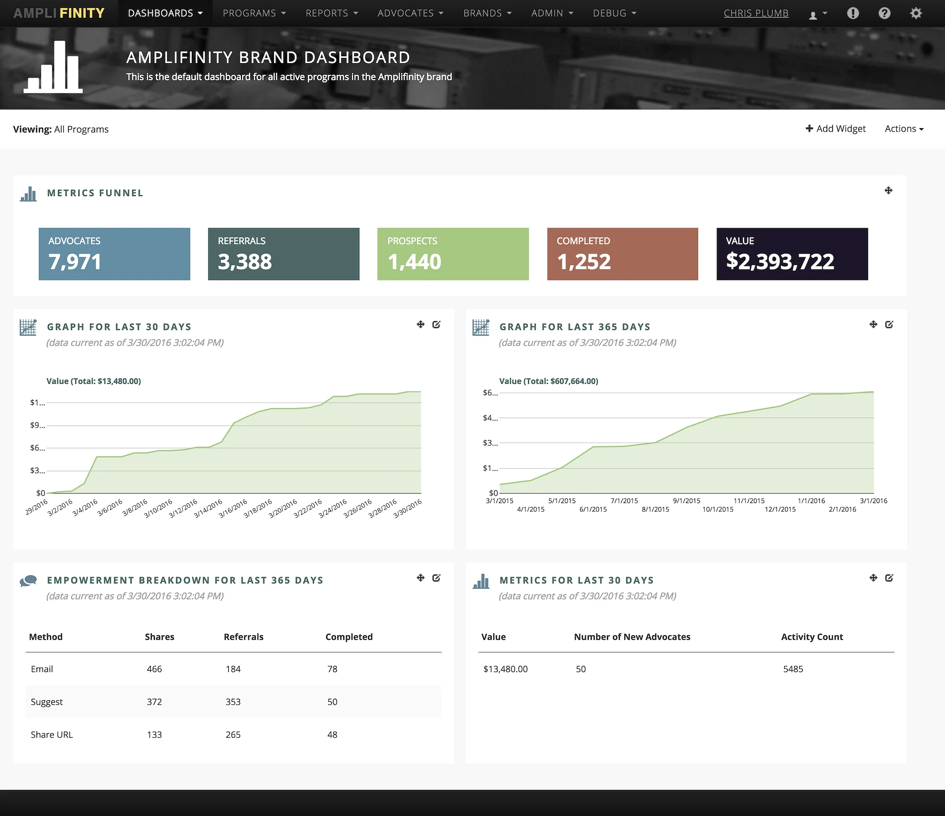
Dashboard, redesigned. New mega nav treatment. Photo-based masthead with icon. New color palette. Improved data visualization.
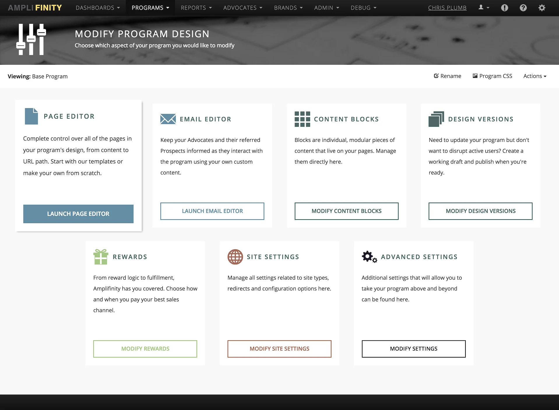
CMS Navigation, redesigned. Removed table in favor of descriptive containers that animate-in on pageload, and increase in size with subtle shadow on hover.
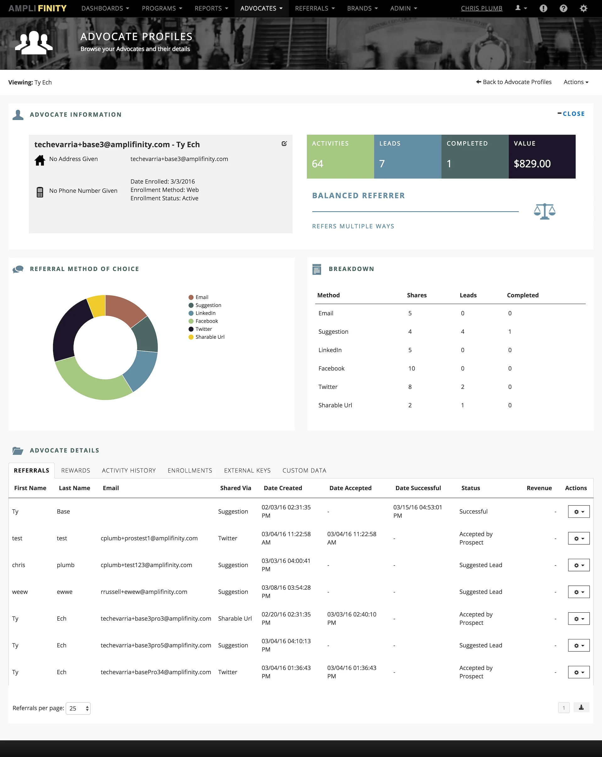
Advocate Profile, redesigned. Improved quality of referral icons, new color palette, improved data visualization.
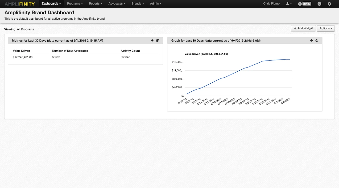
Dashboard – original state, pre-designer. Awkward use of space, poor selection of default data visualization options. Unexciting page.
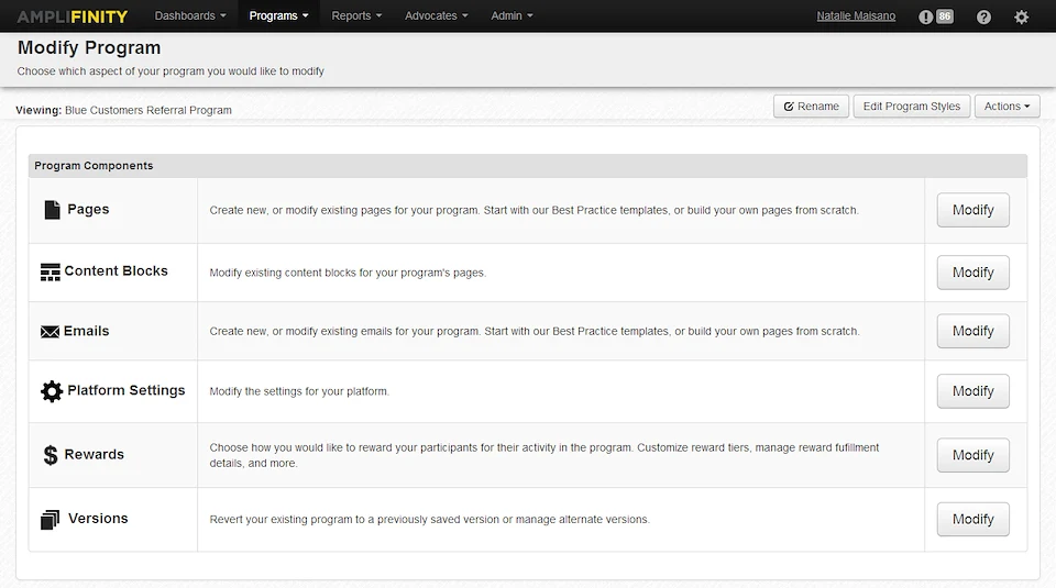
CMS Navigation – original state, pre-designer. Too monochrome, and tabular layout did not lend itself well to descriptions of sub-sections.
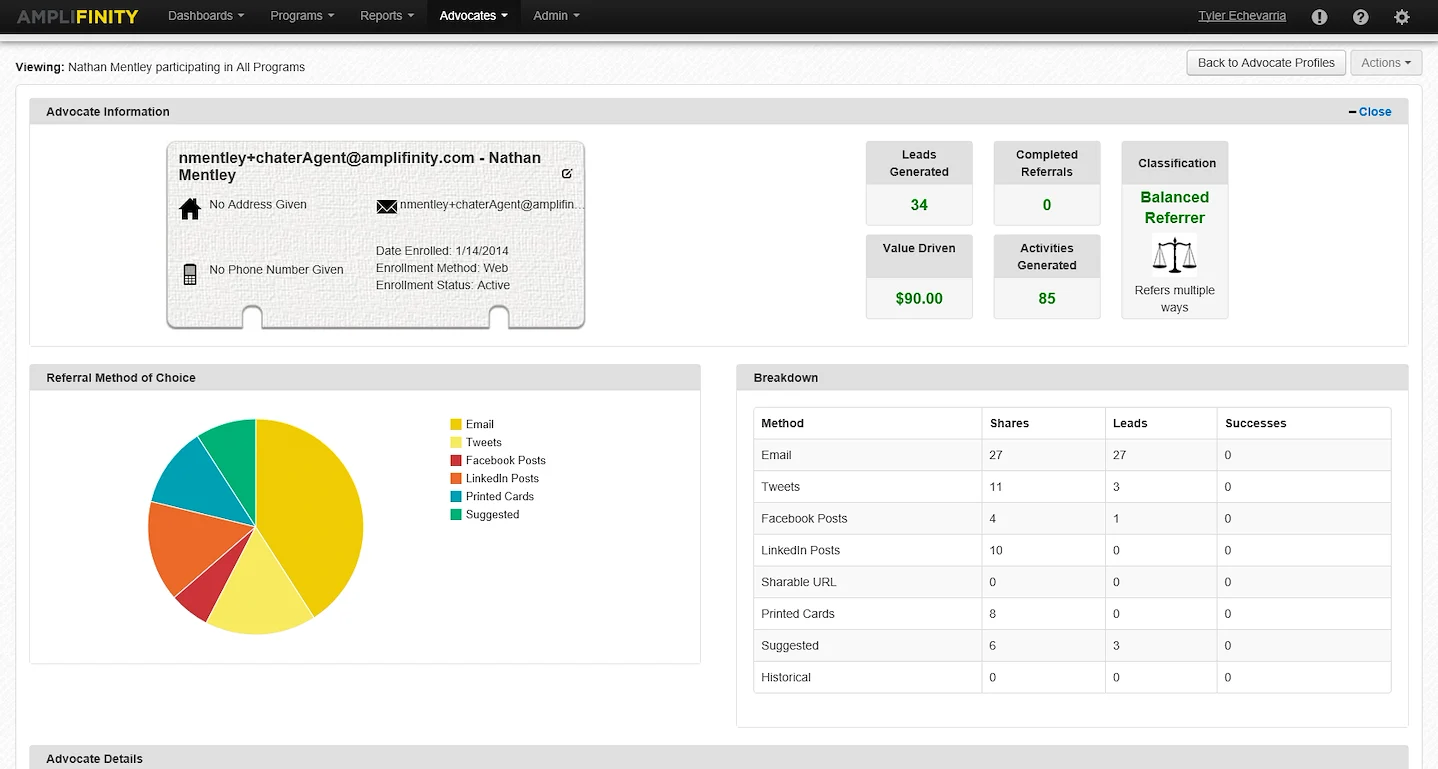
Advocate Profile – original state, pre-designer. Awkward use of space, ugly referral icons, inconsistent color palette.